



Survey Analysis · Data Storytelling · Information Design · Scrollytelling
Turning survey data into a story therapists can use.
A national survey turned into a story licensed therapists can actually use.
- Data Analysis
- Scrollytelling
- Information Design
- Python
- Flourish
- Lovable
The problem
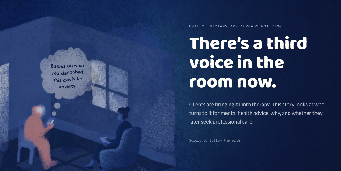
There’s a third voice in the room.
Therapists are increasingly encountering clients who bring AI into session, sometimes a screenshot of a ChatGPT conversation, sometimes a self-diagnosis discovered online. Anecdotally, this was showing up in conversations with my own therapist. What wasn’t clear was whether it was an isolated pattern or something the data could actually confirm, and clinicians had no population-level context for what they were seeing.
The goal
I wanted real data on four things.
How many U.S. adults are actually using AI for mental health advice, who’s more likely to do it, why they’re turning to it instead of (or alongside) a professional, and whether that use pushes people toward professional care or away from it. The scope was intentionally narrow. This wasn’t an attempt to settle whether AI is good or bad for mental health, or to write a clinical protocol.
The project started with something anecdotal: my therapist mentioning she was seeing this pattern with her own clients. I wanted to know if that held up at a population level, using an actual national survey instead of just taking her word for it. And if it did hold up, the point was never to hand clinicians a set of instructions. It was to give them accurate context for a conversation they’re probably already having.
The approach
I built this as an editorial story, not a research dashboard.
Start with real data, not a summary
I worked from raw respondent-level microdata (KFF Health Tracking Poll, March 2026), not the published topline, and ran my own weighted analysis in Python so the findings represented the U.S. adult population accurately.
Test with the actual audience
Two user testing sessions with licensed clinicians reshaped the build. An early version hid key stats behind decorative illustrations; testers scrolled past them without registering the finding.
Separate emotion from evidence
Illustration carries the human context. Numbers carry the proof. Every chart shows its data point clearly, with interaction reserved for secondary detail only.
Writing the numbers so they land
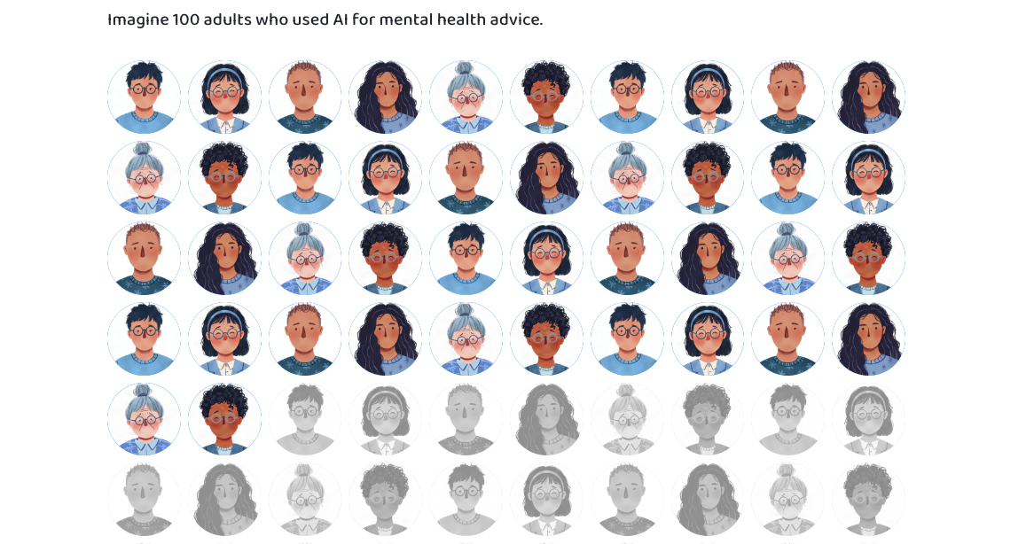
The headline stat, 15.6% of U.S. adults have used AI for mental health advice, means little without a second number next to it: 76.7% say they trust AI “not much” or “not at all” for the same purpose. Neither number alone tells the story. Together, they show AI use happening inside a climate of real skepticism, not confident adoption.

“The illustrations carry the emotion. The charts carry the evidence.”
A finding, not a verdict
The project’s core number, 41.7% of AI users followed up with a licensed professional, is deliberately not framed as a warning. The data can’t say whether AI delayed, replaced, or accelerated someone’s path to care. What it can do is hand clinicians a specific, low-stakes action: ask what a client discussed with AI, and what it told them.
What the data showed
Figures are weighted estimates from the KFF Health Tracking Poll (March 2026, n = 1,343; mental-health-specific subgroup n = 234). The survey measures self-reported behavior and cannot establish whether AI use caused any change in professional care-seeking.
What I learned
Testing exposed a problem I couldn’t see on my own.
My first version hid key statistics behind decorative illustrations. In testing, one clinician said she would have scrolled right past one of the findings without noticing it. That happened in the actual session, not something I guessed at afterward. I rebuilt the page so every core number is visible by default, with interaction reserved for secondary detail. Next time, I would test an early prototype sooner, before investing time polishing visuals that then had to be undone.
Context has to sit exactly where the confusion happens.
Testers got confused about which survey population a chart was drawing from, even though I had a caveat written. It was just placed after the numbers instead of before them. Moving one paragraph fixed what I had assumed was a data problem but was actually a layout problem. I would now attach every caveat directly to its chart from the first draft, rather than adding it afterward.
Tool limits are information, not failure.
I prototyped every chart in Flourish, then hit a real ceiling on scroll animation and pacing once I tried building the full interactive experience there. Rather than forcing Flourish to do something it wasn’t built for, I used those prototypes as a reference and rebuilt the interactive version with AI-assisted development in Lovable. The lesson wasn’t picking the right tool the first time. It was that prototyping in one tool and building in another is a legitimate, faster workflow, and I would plan for that split from the start next time.
Color can accidentally encode a meaning I didn’t intend.
My first version of the demographics chart used darker color for higher percentages, which meant the racial groups with the highest reported AI use ended up rendered in the boldest color on the page. That worked against the non-alarmist framing I wanted. I rebuilt it as one flat color for every bar. Going forward, I would check every chart specifically for this: whether color is carrying a second meaning on top of the one I intended.
What this case shows
This is information design applied to raw survey data: finding the story inside the statistics, shaping it for a specific reader, and being upfront about what the numbers can’t prove.
View live project