



Reporting · Data Storytelling · Information Design · Stakeholder Communication
Turning eleven channels into one clear quarterly story
A quarterly marketing report that leadership reads end to end, and that a director can navigate on their own.
- Reporting
- Data Storytelling
- Information Design
- Stakeholder Communication
- Canva
The problem
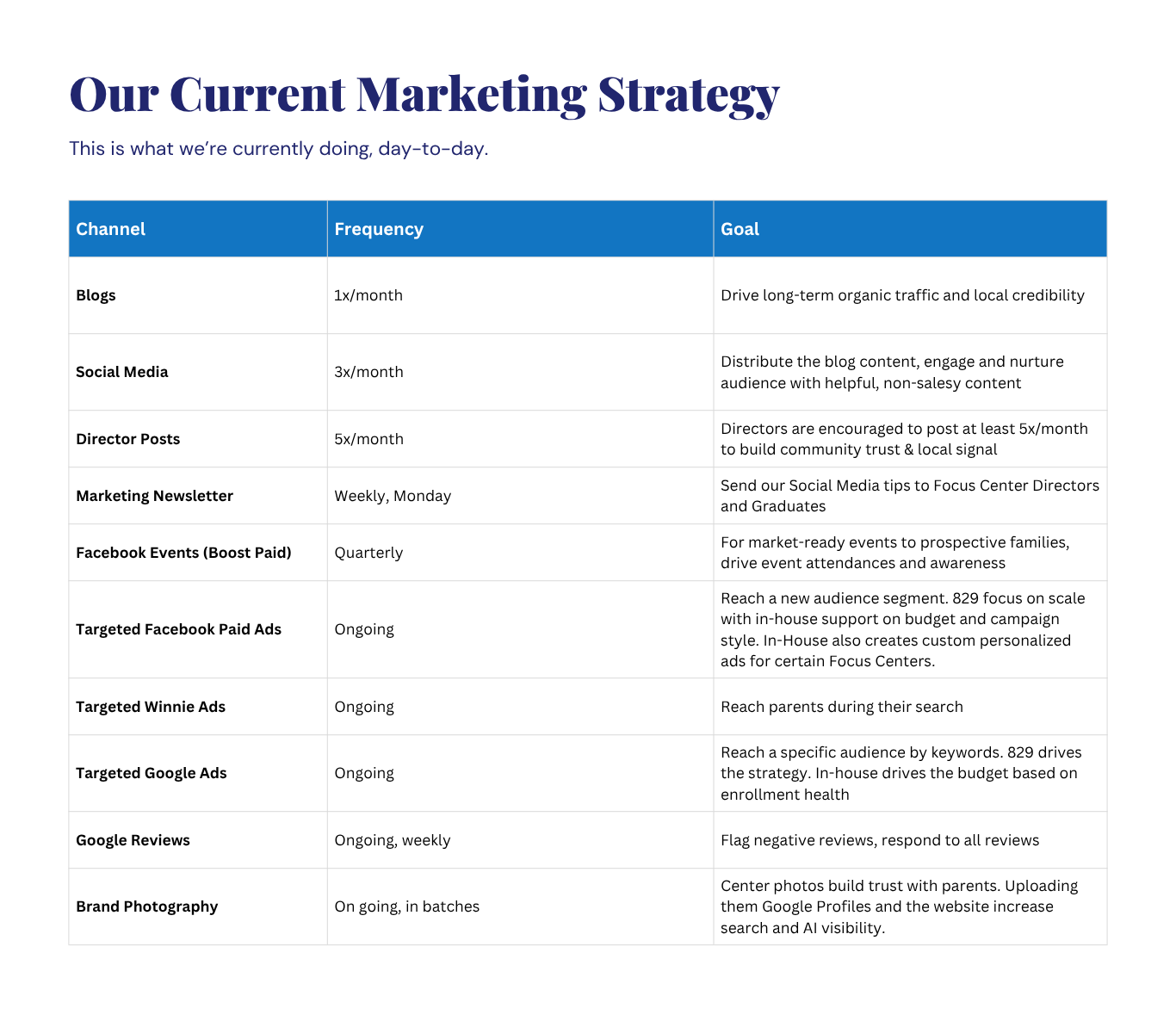
Marketing was running eleven channels across 42 brands — blogs, organic and director social, a weekly newsletter, drip campaigns, paid Facebook, Winnie and Google ads, reviews, and brand photography. Every channel produced numbers. None of them produced a story.
The audience for the quarterly report was mixed: executives who needed the headline in thirty seconds, and center directors who needed the detail behind their own numbers. A dashboard export served neither.
The approach
I designed the report as a document with a point of view, not a data dump.
- 01
Start with the strategy
A single table laying out every channel, its cadence, and the goal behind it — so results are read against intent, not in isolation.
- 02
Lead with the wins
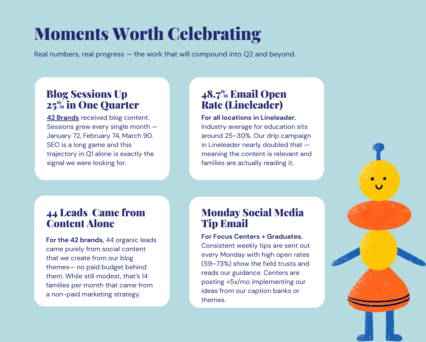
Four plain-language cards: what moved, by how much, and why it matters. Context sits next to the number, not in a footnote.
- 03
Make it navigable
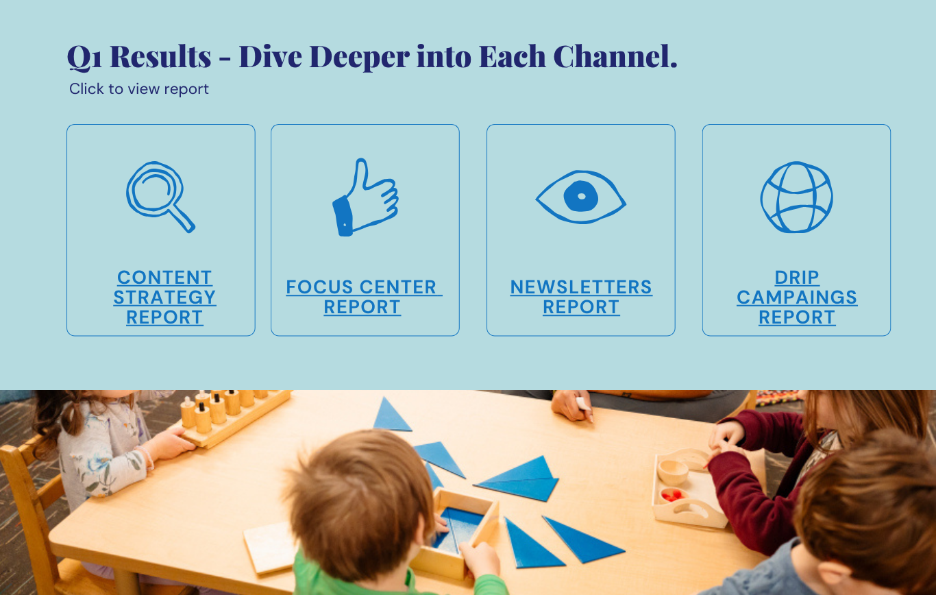
A clickable hub linking to the deeper channel reports, so leadership can skim and analysts can dig without two versions of the deck.
Writing the numbers so they land
Each win card pairs the metric with a benchmark and an honest read. A 48.7% open rate means little on its own; next to an education-industry average of 25–30% it becomes an argument. 44 leads is a modest number, so the copy says so — and then reframes it as 14 families a month from unpaid content.
“A number without a benchmark is trivia.”
One report, two reading depths
Rather than appending forty slides of channel detail, the report ends in a hub: four linked deep dives for content strategy, focus centers, newsletters, and drip campaigns. Executives stop at the summary. Anyone who wants the underlying data is one click away.
What the quarter showed
Figures are as reported for Q1 across the marketing program. They reflect channel trends in aggregate and should not be read as single-channel attribution.
What this case shows
Reporting is content strategy applied to your own work: structuring information for mixed audiences, writing numbers with the context that makes them meaningful, and designing a document people can navigate.